Dec 9, 2010

well this new project is going to get interesting i am running energy. I have tried really hard to understand coding and to finger things out my self but 99% of the time it does not go very well. So far I had designed my layouts in photo shop which is what you are seeing below.
This first one is of the main screen that you come to.


Then depending on what you want to enter in color or black and white.


and then this is an example of a zoomed in of a picture.


So my first group discussion and they told me some good things i am going to flip my blue door 180 degrees and also make it so the pictures look like they are sitting on the wood themselves.

I have come to find out over the many hours that what i wanted to do is harder than i thought. I am trying hard but I am not seeing a difference. I really want to understand this language but so far it is not going well.

So today is the due date for this project. I can say that I am happy with the results there are bunch of things that I wish I had done.My plans is to incorporate alot more motion into the site. But I need to turn in some kind of progress. I am definitively going to work my but over the summer and learn flash. I have just got a member ship to lynda with will become by best friend. Below are some shots of the progress of today. Hopefully Dave wont fail me I can honestly say that I tried hard to understand the program even through I felt like i was hitting a brink wall most of the time even though I have learned a lot from the projects and tutorials.

This was are poster animation project that I have a ton of fun with. When I was told in class of the project I was going to do Carrie Underwoods Ever After off of Enchanted the movie. But when I talked about it is class and show my poster with the song Dave's facial expression claerly said not a fan. After thinking about it I decided to do something different.

My new idea is to do 30 seconds of president Eisenhower speech after pearl harbor was attacked.


Dave face definnitally like this idea better than the original.
So it has been a while since i have been on my blog.
we shall start with the HTML web page project
that was a project that found interesting below are some screen shots of the different pages.


Here are some examples of the pages of the website. The layout stays the same for all pages only the text and pictures change.

This project taught me a lot about dream weaver and layout design for web sites. There are some things that I Would like to change about mine. I would make the icons have color in them when you click and are on the page. Also have a little more content.

Nov 23, 2010

working on flash animation for last project

well so far this has been an interesting process learing all about flash. I have done my designing in photoshop for about 90 percent of my design.

Sep 23, 2010

Nathan Firth

1. How to insert an image and how to have the image repeat itself horizontally and vertically or both.

2. This lesson will teach the learner what he or she needs to do in order to insert an image into Dreamweaver. Another part of this tutorial shows the student how to make you image repeat horizontally, vertically and both.

3. To start this tutorial you will need to already have working html/css page that has your headings and body sections of your web page. The image that you want to put on your website. This tutorial should take you about 5 minutes or less.

Steps

1. Open Dreamweaver and open you html/css document.

(Make sure you have a working html/css page that contains headings and a body section at least.) Make sure that your htlm/css sheets are in one folder

2. Now find the section called body in your html/css page


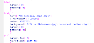
Now the beginning of the body section starts with this symbol { and the end is shown by this symbol }. You need to create a new line right above the } by going to the end of the line above it and pressing enter.


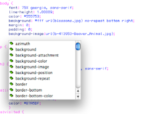
3. Once you hit enter a prompting box should come giving you the option of selecting background image.

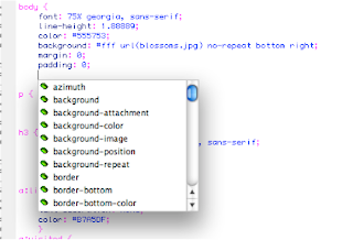
4. Once you have chosen the background-image option another box will appear and give you the option to browse choose browse.


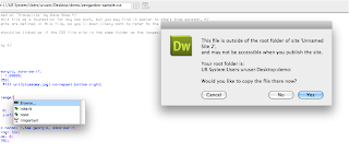
5. Now find you file in the location you have it saved on. Once you have the image that want to include in you file then press the choose option. You might have this box appear which is telling you that your picture is not in your “root folder or main folder. You want to say yes so that your image is in the main file that has everything else in it. Then click yes and the picture is now in you file.


6. Your finished link should look like the example below. Make sure you are Adding ; this symbol at the end of the line so the computers knows that you are done.

We are almost there, now we will work on how to make the same image repeating it self either horizontally, vertically or both.

If you have already closed your Dreamweaver document that you work on above please go ahead and open it back up.

Steps

1. With you document open now find the body part of you html/css page.

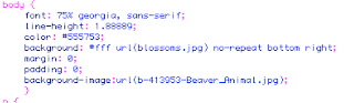
2. Press enter at the end of the line background-image. A Box will come up that you should recognize.


3. Click on background repeat; now here is were you get to chose if you want you image repeated horizontally, vertically or both.

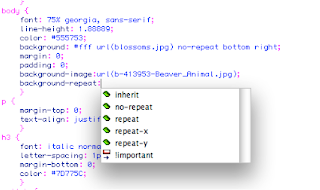
4. Now you need to decide on were you would like you image to repeat it self.

(Below is a table that shows you the commands or value and a description of what each one does.)

5. Now that you have chosen to how you want it to repeat make sure you add (;) at the end letting the computer know that you are done with that action.
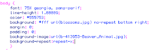
Here is an example.

6. Now if you wanted to make your image repeat other directions please refer to the table that is above step 4. You would still type in background-repeat: repeat- at the same location as before just changing the ending of you line to instead saying repeat-x to another code such as repeat-y.

Conclusion

You did it, you know now how to add a picture to you web page and if you want to have it repeated how to do that.

If you have any questions or would like help send me an email at Firth343@hotmail.com

Sep 21, 2010

updated post about the website

hello everyone

This is an update on the website project. So far i have started mostly over a couple of times with every time getting somewhat better. It has taken so much time, if i was to add the time that i have spent it would add up to about 15 hours. I have come to relize that the computer lab is pretty much my seconded home.
So far i have learned that making a website it alot harder that i thought it would.

Aug 31, 2010

2nd part of project one

The navagation of the ikea site is very user friendly. The Merchandise is split up by rooms in the house and the little things that you would need in the room. The font style seemes to be uniform throughtout the web site showing a uniformity thourghout the web site. Moving around the website is farly easy, the link at the top of the page will get you get to anywere in the wed site. Besides using the main bar you can use the usual icons at the top of internet explorer the page back and the pag forward. You do have the option of creating an account so that you can make a shopping list that would record your history and item that you can put on a wish list and get them later. The top tab of the page tells you were you are at in page but that is the only place that it tells you were you are at.

3. There is not a ton of color on this page which i find refreshing. The only color is the Ikea name and the tool bar that helps guide the viewer through the website. The photos of each room offer a focus and direction to what the designer wants the customer to focuse on.
The overhall feel of the webstite is organized with the font being the same throught the web site. Navigating throught the web site is easy and confortable. The hierarchy is shown by have the larger font at the top and the sides of the page. The smaller type is at the bottom of the pages showing what the designer wanted the viewer to see first. The visually hierarchy is shown by having the main picture be the biggest and the other pictures being less than half of its size.

4. This site is full of anything for the home from drawers knobs and handles to the appliances for the home. The sites purpose is to give the home owner/buyer an easy way of buying not just furniture but pretty much anything for the home all in one web site. The site also offers ideas for decorating in any room of the house or living quaters. The majority of the site is presented in a visual form for the viewer; there are some important typography links on the web page. The words on the left side of the page and the top help to reinforce the pictures in the middle of the site.
The Web site does a great job fulfilling the user needs by once a room is chosen it then offers links to items in the room that would go into the room. For example if you click on the bedroom link on the left side you would see likes titled lighting, mirrors and other products.

5. The site audience is anyone who is either redecorating a room in their house or apartment or building a house and wanting to ideas and help. The designers have done a great job of communicating with the user by showing pictures of different rooms of a house and having them all ready decorated. Also have places in the pictures were the user can interact get a closer look at the items in the pictures.

IV. i was thinking of doing a web site showing fun things to do in British Columbia Canada